Tinder Interface Redesign
Role: RESEARCHER
TYPE: group project - Redesign | Amina B. ANA P. ISAAC M.
duration: 1 week
Methods of research: master-apprentice model, semi-structured interviews, THINK OUT LOUD
SKILLS: user testing, user interviews
overview
Tinder is an online dating application. The interface allows for users to swipe “like” or “dislike” on other profiles. Although Tinder has won its popularity amongst college students and more, there are still many unintended human errors that arise from the interface.
Design Problem
My team and I conducted interviews of individuals with different experiences in using Tinder. My team and I wanted to uncover the human errors the interface of Tinder produces. The most common errors included the following:
Action based slip where swiping too fast can unintentionally lead to swiping right/left on somebody
Action based slip where information button for accessing and exiting the profile biography is not clear
Knowledge-based mistake where the swiping function has too many controls that is unknown to users
Knowledge-based mistake where flipping through profile pictures is hidden
Interviews were conducted and observed at Geisel Library. Utilizing the master-apprentice model, interviewees were asked to complete tasks on Tinder using a completely new Tinder profile created for research purposes. A total of 14 interviews were conducted and the results were later organized on a spreadsheet. I conducted 5 interviews with novice and experience users of Tinder. While interviews were conducted, I switched between roles of being the interviewer or the observer that took notes. The phone that was used had a screen recording feature to record any slips or mistakes that the interviewee may have produced. Here are the tasks that my team and I had each interviewee complete:
“like” someone
“dislike” someone
access “more information”
access more photos
exit “more information”
explain what the buttons on the bottom of the screen mean
After the interviewees completed the tasks, I would then ask the user about their experience overall with Tinder along with some follow up questions. A sample of the interview questions is shown below.
Interview Questions
key findings
During our interviews, we noticed that some trends surfaced from our findings, primarily that novice user errors originated from both slips and mistakes as they were not familiar with the app, but those who were experienced users or were familiar with the app to some degree, still made errors, but strictly in the form of slips due to Tinder design flaws. The most common errors we found during our interviews were the following:
Error 1: Swiping too fast and then unintentionally swiping right or left on somebody
9 of 14 interviewees indicated that they would perform an capture-slip by being in the habit of swiping really quickly on one side
8 out of 9 experienced users were familiar with the functions of swiping, but still swiped left or right when they intended to swipe the opposite direction
25% of the novice users lacked knowledge of the swiping functions
Error 2: Ad pop ups leading the users to tap on it accidentally, resulting in them being redirected out of Tinder
This capture slip was observed 6 out of 14 times during the interviews
Error 3: Swiping has too many controls (like, nope, superlike) that’s unknown to users
On average, 50% of the interviewees found that the feature that characterizes Tinder is one of the many that causes a knowledge-based mistake
5 new Tinder users and 100% of them were not sure how to carry out the swiping features
Error 4: Information button for accessing the profile is not too clear; users are not sure how to exit the profile
7 of the 14 total interviewees found the information button leading to the profile, but failed to exit out of the profile correctly
Half of the interviewees intended to exit the the profile by swiping up and down, but ended up staying in the profile page
In the figure on the left is the profile of the potential match. In order to exit it, the interviewees had to press the down arrow enclosed in the red button as shown in the right figure. However, interviewees swiped down instead and end up maximizing the picture instead of their intention of exiting the profile.
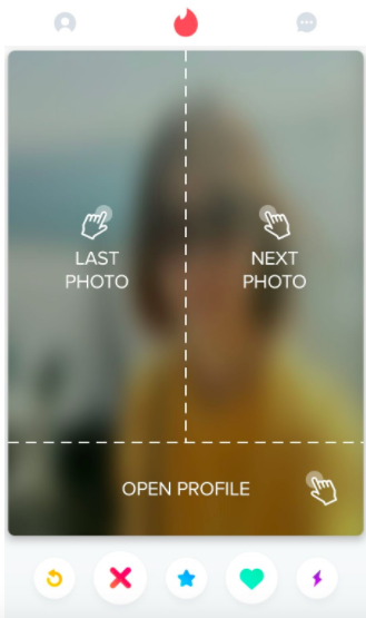
Error 5: To access more buttons, you tap lightly on the left/right, but it is too closely related to swiping and is also not commonly known.
11 of the 14 interviewees were unaware of the tapping feature to access other pictures of the potential match
When we informed the new users of the tapping feature, but not how to (tap right for next photo and left for previous photo), all of the new users exhibited accidental swiping.
79% of the interviewees consciously problem solving how to tap through the photos.
This is a tutorial that is shown for only a moment, which most new users see and forget, or don’t see at all. The tapping is too closely associated with the swiping features and it causes both knowledge-based mistakes and action-based slips for new users and old users.
Error 6: Buttons are too confusing because the signifiers are not universally known
50% of the interviewees found the buttons confusing because the buttons are not universally known.
2 of the 5 novice users described the buttons as being confusing and redundant.
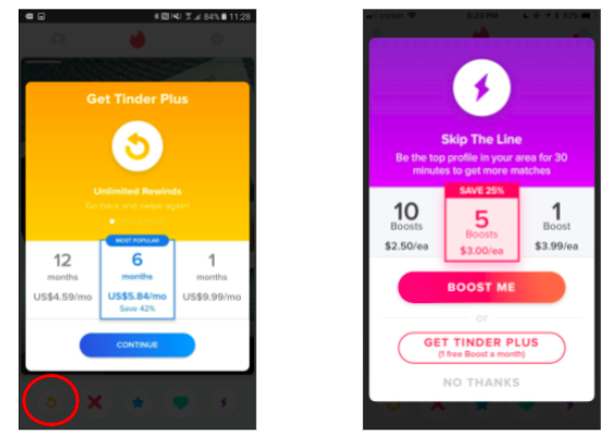
The first button is the rewind button. The second is nope, third is to superlike, and fourth is to like. The last button is to boost your profile to the top allowing your profile to be seen more often.
These buttons are not universally known. As you can see, the left figure is to rewind and it has button circled in red that indicates you go back. Some interviewees thought it was to go to the previous photo rather than the previous match. In the right picture, the boost button is a lightning symbol that most interviewees (especially new users) found confusing. The result of these excessive buttons adds to confusion, which in turn leads to a knowledge-based mistake.
Out of these recorded errors, we found that Errors 1, 3, and 5 were the errors that most Tinder users encountered. These errors are the errors that my team and I addressed in the redesigns.
redesigns
Redesign 1
Redesign 1 Example
Above, you see the best option our group chose for a redesign of Tinder’s interface. Ease of use in our first redesign is increased by minimizing buttons to only like and dislike. This also increases the amount of clarity that users encounter. Here are the aspects of the app that we changed:
Removed the swiping feature for liking and disliking a potential match
Limited the number of buttons to two
Moved the more information button further away from the other buttons
Made more of the biography available on the home screen
Used the swiping feature for accessing more photos instead of tapping
Buttons were limited to only two because of the data found from Error 6. Many new users felt confused while looking at all of the five buttons because the signifiers of the buttons such as a star and lightning bolts are lacking clear signifiers. Users did not know what each button stood for so in order to increase clarity and minimize accidental clicking, my team and I only included the like and dislike button. The information button is originally placed very close to the five buttons and is small in size. To try and minimize error 4, we moved the information button further away from the buttons and made it a little larger.
Redesign 2
Redesign 2
This redesign keeps the function of swiping to like and dislike. In this redesign, my team and I focused on mitigating the errors in accessibility. Error 4 posits a problem with accessing more information on the potential match. For this redesign we made the homepage of Tinder have all of the information readily accessible. We also took out the pink button that controls the access of the profile because all of the information is already available by scrolling down. We made the photos available almost like an instagram feed to mitigate the errors in accessing the photos due to unclear signifiers of whether to tap or swipe. This redesign is more accessible than the first redesign but less easy to use and clear with the decrease of buttons.
design spaces
While analyzing the data we’ve collected, we realized the top four trends with the Tinder interface have to do with clarity, ease of use, redundancy, and accessibility. We then compared Tinder to the other popular dating apps such as Bumble and Hinge.
This design space chart is used to rank Tinder, our redesigns, and Tinder’s competitors.
final solution
After creating the redesigns and comparing the features to Tinder and other competitors, my team and I concluded that Redesign 1 is the winner. Redesign 1 has ease of use and clarity because its design is simple. This is something that I discovered from the interviews. Going back to the key findings from the interviews, Redesign 1 addresses the most common errors.
Error 1: Swiping too fast and then unintentionally swiping right or left on somebody
Error 3: Swiping has too many controls (like, nope, superlike) that’s unknown to users
Error 5: To access more buttons, you tap lightly on the left/right, but it is too closely related to swiping and is also not commonly known.
Final Solution


