Tapple Redesign
Role: UI/UX Designer
type: freelance
duration: JaN 2021
SOFTWARE: FIgma
SKILLS: Human-centered Design, Research, and Prototyping
Overview
Tapple is a first real-world conversion platform built to gather first-party data through instant access to mobile experiences via QR codes. With the pandemic rising, a contactless QR code is valuable. Users can simply scan the QR code and access the Experience. This is crucial when it comes to contactless COVID surveys regarding any recent exposure. I joined Tapple as a Freelance UI/UX Designer and provided a quick turnaround for their platform’s redesigns.
*Some of these redesigns are still in the process of being implemented.*
design problems
The project at first called for changes to the Experience and Reports pages, which were originally cluttered and hard to navigate. I coordinated with the CEO and CTO to redesign the Tapple website for a better user experience. This included weekly design deliverables conducted within a 5 day period. I utilized Figma to redesign Tapple’s website in several areas: Experience page, Reports page, Toast Notifications, Navigation bar, and further popup overlays.
experience redesign
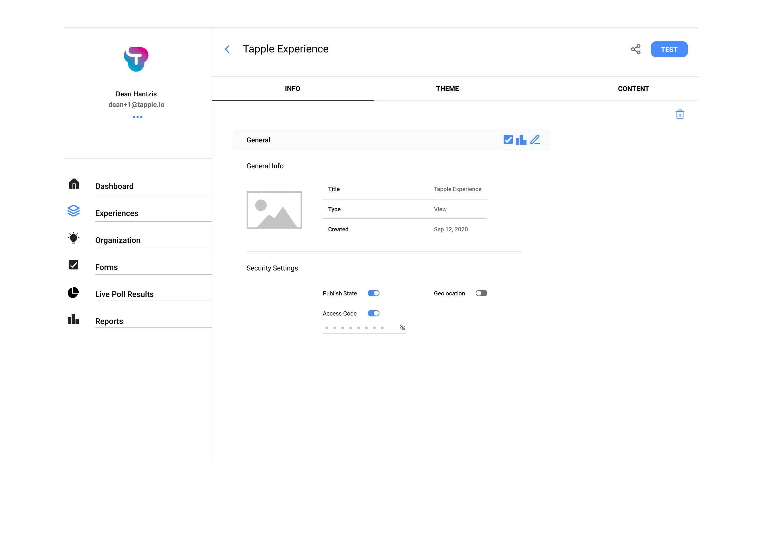
The experience page was originally cluttered, hard to navigate, and had no consistency. By providing feedback in ways to navigate the tabs within Experience, and adding accordions to ease the user’s eyes, I was able to design a much simpler, cleaner, and intuitive experience. The amount of space in the Content tab is far too stretched. At first glance, there is too much information thrown at the user.
I began by breaking down what part of the website was confusing and not intuitive. The issue the Experience page has is with the organization. I suggested a solution with an accordion-style, which collapses and opens upon clicking. Moreover, I also made changes to the icons used when sharing, testing, editing, uploading, etc. This overall makes the Experience section much cleaner and intuitive. Below are the different sections of each section within the Experience: Info, Theme, and Content.


reports redesign
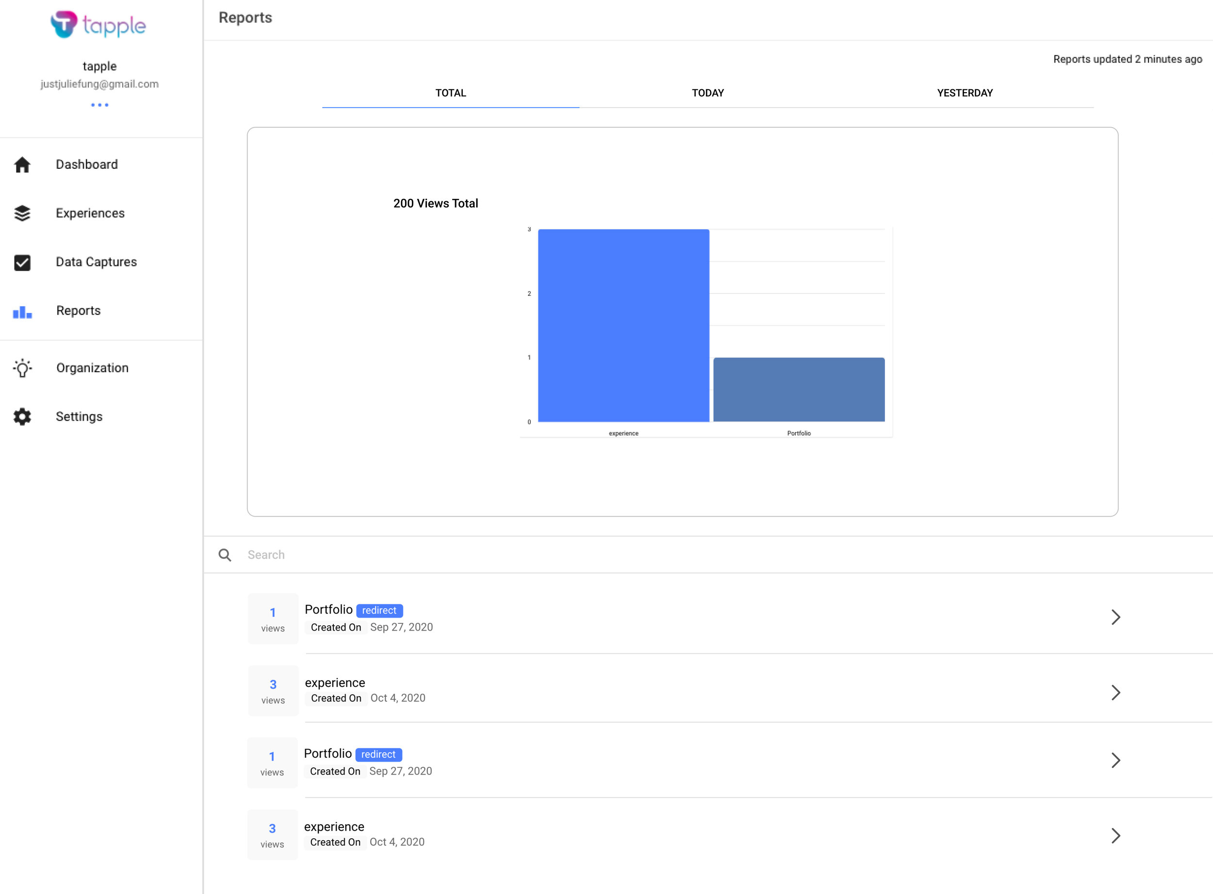
The reports page was hard to navigate in terms of accessing different experiences and graphs. What I provided was a system of tabs to switch between Today, Yesterday, and Total engagements. This made it easier to associate graphs with each of the experiences. For instance, clicking the experience automatically shows the individual graphs associated.
In this iteration, I added clearer tabs for Total, Today, and Yesterday with the respective graphs and list of all Reports underneath. Upon further discussion with the CEO and CTO, we wanted to move forward with this redesign and make it even more intuitive. In this iteration, the graphs and tabs seem to be disconnected.


In this iteration (the final winning iteration), I was able to unite the tabs with their respective graphs. Moreover, as you select an Experience from the list, the graphs change respectively. Navigating through the Reports page is much more intuitive and organized with the respective graphs upon clicking the different Experiences or tabs.


Toast notifications
Toast Notifications were originally dull and empty. I redesigned them to pop more to the user by adding simple yet powerful designs in the icons and notification designs. The previous toast notifications wasted a lot of space and didn’t stand out, which was crucial especially when it comes to a warning or error notification. This feedback is critical to the user when carrying out an action. The Toast Notifications I redesigned for success, error, reminder, and error (mobile view). By adding a simple icon, the toast notifications come alive, boosting the overall user experience.
navigation bar
The navigation bar included changes made to the organization logo as well as profile settings. By providing feedback on different icons to distinguish the navigation bar sections as well as organizing the layout, the experience is more intuitive and consistent. I explored different icons around the user profile for Account Settings, Organization Settings, and Sign Out. After brainstorming and meeting with the rest of the Tapple team, we decided on a combination between the second and fourth redesign.
Below is an image of the navigation bar redesigns implemented to the Tapple website.
popup overlays
These popup overlays are specifically focused on the Virtual MFA, Password Change, and Request Password Reset. Original designs were not consistent and clean. When pointing out the issues of how it not appealing to the eye, I focused on making the redesigns clean, minimal, and simple. I kept the consistency in the icons in terms of line weight, color, and placement.


High Fidelity Prototype
This prototype was created in Figma for editing the Theme & Preview section of an Experience. The CTO utilized parts of my redesign for the Experience page, sacrificing some parts to keep the responsiveness of the website. I created a clickable prototype for the redesigns made for each of the states including different titles and organization logos of an experience. On the right is a video of the clickable prototype.
Below is a clickthrough of the Tapple website with my redesigns implemented.
To view changes of the live site, click here or go to https://tapple.live/


