Philz Coffee Redesign
Role: RESEARCHER
TYPE: group project - Redesign | Amina B. tristan e. kelsey g. austin l. matthew m.
duration: 2 weeks
MethodS of research: master-apprentice model, contextual and semi-structured interviews
SKILLS: prototyping, user testing, user interviews
overview
Philz Coffee, the successful Bay Area chain, has become a major hit lately by opening its new location near the UCSD campus. The coffee shop is based on a customer satisfaction model that relies heavily on customer trust and loyalty. At Philz Coffee, the employees want you to be completely satisfied with your drink. They offer the option to alter your drink after a brief, informal evaluation step to ensure the drink matches individual customer preference.
design problem
Philz Coffee is not intuitive to novice users. The customer flow lacks signifiers, and users are unsure of when to order and pay, or vice versa.
methodology
Interviews were conducted and observed at Philz Coffee. Utilizing the master-apprentice model, interviewees were asked to describe their process of ordering at Philz Coffee. A total of 20 interviews were conducted at Philz itself and based on an attribute system that was later organized on a spreadsheet. I conducted interviews with novice customers who had never been to Philz and loyal customers in order to avoid any biased results.
Additionally, employees were also interviewed to better understand the system at Philz Coffee. Ultimately, Philz Coffee values customer service. Customers are allowed pay either before or after they get their drink. If customers are not satisfied with their drink, they don’t have to pay at all.
In order to not bombard the customers, my team and I split into groups of 2 where one person observed and took notes, and the other was in charge of interviewing. Some of the questions that came to mind as my team and I came up with these interview questions were: What do customers do once they enter? When do they pay? Where do they wait? These are all ambiguous at Philz Coffee. A sample of the interview questions is shown below:
Interview Questions
key findings
Ordering and paying system isn’t intuitive
16 of 20 interviewees do not know where the line to order is because there is a lack of signifiers.
10 of 20 interviewees were not aware of when to pay for their purchase because of the lack of system.
Confusing Waiting Area for drinks
14 of 20 interviewees found that the waiting area and sitting area are ambiguously combined, causing traffic.
Customers do not know when to pick up their drinks
10 of 20 interviewees do not know when to pick up their drinks because employees rely heavily on face recognition and call out the names of the drinks as opposed to the name of the customer.
The core problem is the flow of customers at Philz. Customers do not know what to do due to the lack of signifiers, confusing order of stations, and limited space in Philz Coffee. This causes many errors for novices. Thus, the flow of customers varies depending on the level of experience the customer has as shown in the diagram below.
Prototyping
Our reasons for redesigning was to improve customer flow, mostly by reducing the opportunity for as many human errors as possible. We identified that the errors originate from a lack of signifiers to lines, the confusing waiting area, and ordering/paying/establishment process confusion. In the redesigns, we focused on adding more signifiers, utilizing the open space more efficiently, and making the placement and order of the stations more intuitive.
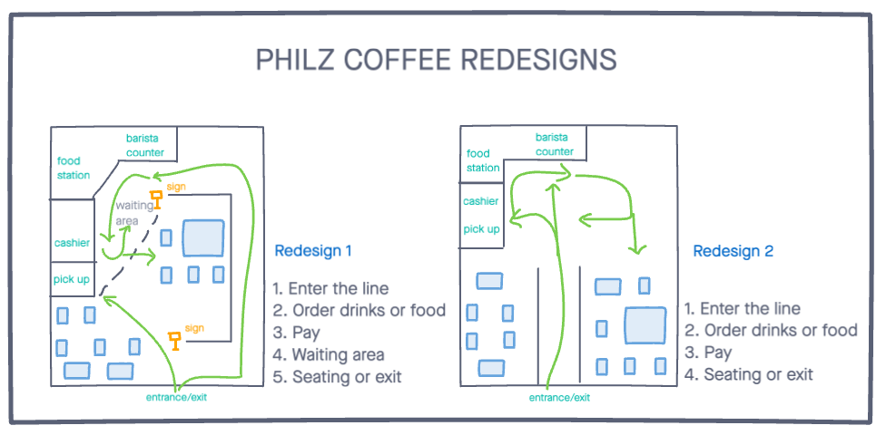
My team and I came up with two redesigns for Philz Coffee:
Redesign 1
There are many signifiers to indicate where the line and waiting area are, and where the cashier is. This mitigates any errors due to the ordering and paying system, which was a huge problem for first time customers. The line is intuitive and similar to the current line of Philz so that it can be easily adapted, but it could feel crowded during busy hours. However, the uniqueness and current vibes of Philz is preserved in this redesign. There is less technical space to actually wait, but more areas to sit compared to the current layout.
Redesign 2
The floor space is a potential issue because there can be cross traffic and confusion on where to sit and exit. These can lead to potentially extensive problems such as a loss of customer satisfaction, efficiency, and errors (spills, collisions, injuries). The line is intuitive and straightforward, but the waiting area is ambiguous. Since there is no actual designated waiting area, the line could be prone to overflowing.
Overall, both redesigns are an improvement compared to the current layout of Philz, but redesign 2 is more confusing and can affect employees as well as customers in the long run. Although the line is right at the entrance and it’s intuitive, it doesn’t mitigate a lot of major errors. With this, we created a more detailed interior redesign, our winning candidate, Redesign 1.
Final Solution
The final design solution takes the form of a floor plan outlining the customer flow of Philz Coffee. It was created through Sketch by one of my group members.
The customer flow of this design takes the form of iterated versions of our initial prototype, Redesign 1 and Redesign 2.
Customer Flow
Enter the line: There are clear signifiers as to where the line begins.
Merchandise is displayed in line
Menu is displayed in line
Order drinks, order food
Designated waiting area
Pay and find seating
There are clear signifiers as to where the line begins. Merchandise is displayed throughout the line, which saves space while potentially generating more revenue due to a more obvious placement of these items.
The seating is not as limited and the lines are away from the seating. This creates more space and is less of a distraction to people who might be studying at the coffee shop.
There is a designated waiting area, distinct from the seating. This reduces traffic and confusion.
Supplemented is a video that I produced and edited that contains insights directly from stakeholders outlining errors that arise in the customer flow of Philz Coffee.
All in all, the final redesign keeps a lot of the features that Philz already has but improved on them based on the design flaws we found. Because my team and I designed it with Philz’s core value of customer loyalty and customer satisfaction in mind, the space maintains the authentic “Philz” vibe. The placement of each station, style of furnitures, wall decoration all reflect the thoughts that my team and I put into this project.


