PharMate
Role: Researcher and UI Designer
TYPE: interactive Kiosk GROUP project | madeline m. Ryan M. Allie P. lam p.
DURATION: 3 weeks
SOFTWARE: Figma
methods of research: semi-structured interviews
SKILLS: user interviews, user testing, wireframing
overview
Healthcare is a necessity for all walks of life no matter your age, occupation, race, etc. Through research and personal experiences with pharmacies and kiosks, we found that pharmacies have a high potential for success with a state of the art kiosk system.
design problem
Many pharmacies deal with long wait times and unavailability during off hours, making it a pain point for those with busy schedules. Additionally, older demographics are hesitant to visit pharmacies due to their language and cultural barriers, often having to recruit their loved ones to accompany them on pharmacy trips, a hassle for everyone involved. Our kiosk solves these pharmacy inefficiencies via a locker system and mobile app in addition to world languages that can be accessed by people of different ethnicities and backgrounds.
methodology
Before interviewing, my team and I did some initial research on the nature of pharmacies and kiosks. Each member of my team interviewed 5 users on their experience with a pharmacy and a kiosk. Some of the key findings I found through these interviews were the following:
Lines are long at the pharmacy
Kiosks are geared toward experienced users
People who are familiar with process and want to skip the line
Younger generations are more comfortable with technology
Some users are not English-speakers
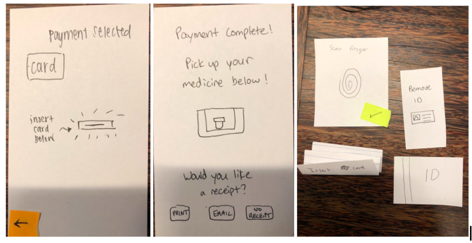
Using the key findings from initial interviews, my team and I came up with the following frames we wanted in the kiosk: welcome, verification, prescriptions, order summary, payment, and thank you. Then, I created a paper prototype of these wireframes (as shown in the gallery below). This initial prototype was used to conduct user testing.
Utilizing the Wizard of Oz technique with the paper prototype and sticky notes, each user was given 3 tasks to complete:
Start by scanning your fingerprint
Select all of the prescriptions available to pick up
Pay for the prescriptions using card
key findings from paper prototypes
In these interviews, there were moments in which the users felt confused or didn’t know what the next step was.
Visual feedback is essential to bridging the user’s gulf of execution and evaluation
i.e. the paper prototype had one universal card reader. One of the users didn’t pull out his form of ID because there was a lack of feedback. The user reached the payment stage and was confused that his ID was still in the card reader. Because of this, my team and I decided to have two separate card readers, one for identity and the other for payment.
iteration 1:
The paper prototypes helped us determine which areas needed to be improved for the mid-fidelity prototypes.


Iteration 2:
The digital prototype wireframes contain the following frames: welcome, verification, prescriptions, order summary, payment, and thank you screen.

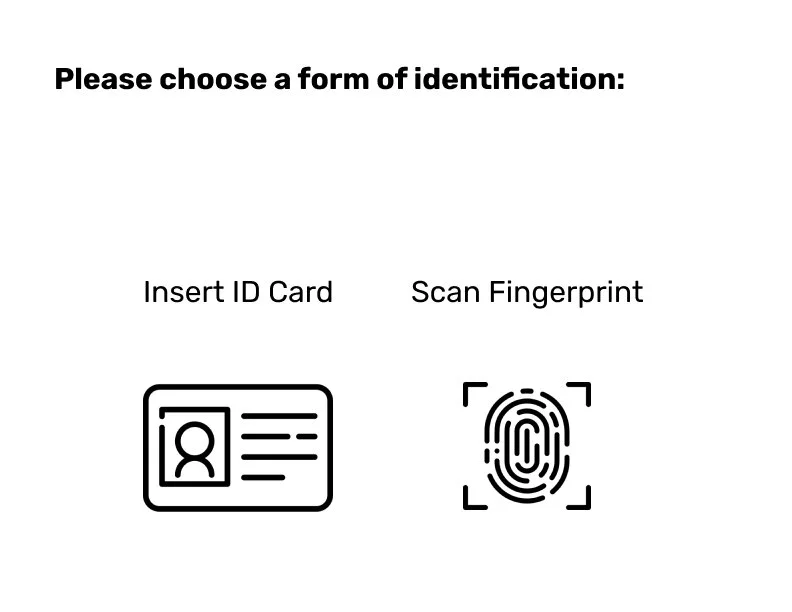

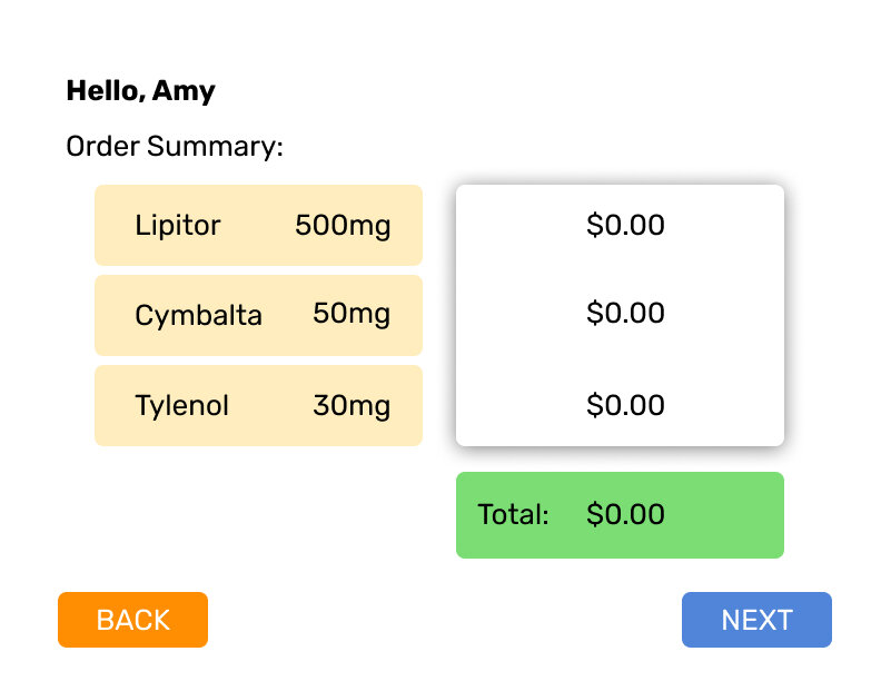


As my team and I consolidated data, we made revisions and focused on clarity and ease of use. I conducted further user testing with this wireframes prototype as digital screens. 3 UC San Diego students were asked to complete the same 3 tasks of: start by scanning your fingerprint, select all of the prescriptions available to pick up, and pay for the prescriptions using card. After completing the 3 tasks, I interviewed the users with a list of questions shown below:
Digital Screens User Testing Questions
key findings from digital prototype user testing
A common point of confusion during our task was that there was little feedback when selecting items i.e. prescription selection screen needed more visual feedback whenever an item was selected
We also asked our users about their experience with other kiosks compared to ours and all three users praised our pharmacy kiosk for its simple, straight forward process which had little chance for error. The users said that other kiosks tend to be more convoluted with many options and use cases and felt that this one was a much simpler experience.
All of the users also pointed out the lines they encounter at a pharmacy, which was a common issue for our testers whenever they went to go pick up medicine. In general, the users made it through our task with little to no hiccups and had positive views on the overall process.
iteration 3:
After conducting these user tests, my team and I worked on improving these digital screens. We took the feedback from our user testing and implemented the changes in our second digital prototype:
Provide more feedback
Add an actual price in the payment screen
Make payment screen more clear
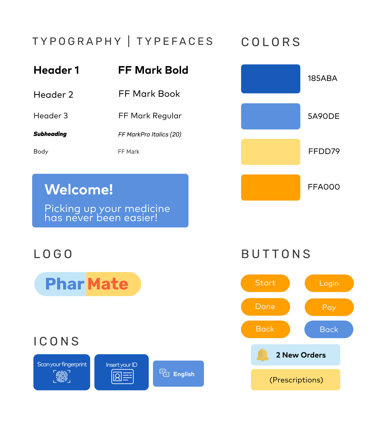
Moodboard and Style Guide
Gathering insight from the colors at hospitals and pharmacies, the moodboard was specifically created using blue and orange color palette because it evokes a trustworthy and soothing feeling, which is essential when interacting with medication. Some of the photographs on the moodboard itself were taken by me.

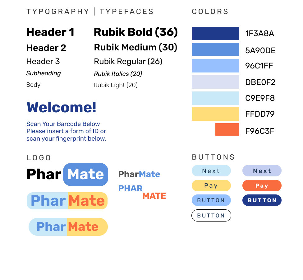
iteration 4-5: mid to High Fidelity physical Prototype
After establishing a rough prototype for the interactive screens, I began creating and modifying the cardboard prototypes to match the interactive prototype screens I contributed in. The cardboard prototype was first made from a shoe box with the Wizard of Oz technique. A cut out for any card and money transactions is implemented in the prototype along with a drop out for the medication.
Moving forward, I built a bigger prototype to resemble an actual kiosk that contains all the features my team and I valued: fingerprint scanner, payment for card and money transaction, QR code scanner for mobile pick ups, locker system for picking up medication, and a multi-language kiosk.
Initial Cardboard Prototype
As I worked on the cardboard prototype, I even learned how to wire a circuit to power LED’s for the card transactions.
Final Cardboard Prototype of Kiosk
final solution
pharmate — a kiosk that solves pharmacy inefficiencies via a locker system and world languages
The PharMate kiosk-locker setup is meant to coexist with, not fully replace, traditional in-person pickup. The idea is, that divided between the traditional pharmacy line, the kiosk line, and the mobile app, wait times would be reduced all around.
supplement
I designed a poster using Adobe Illustrator and also created a mobile pick up application via Figma. The mobile version makes refilling medication even more easy and convenient.
Flow of PharMate Mobile App
PharMate Poster that I created through Adobe Illustrator


